US: Default Comedy Part 2
-
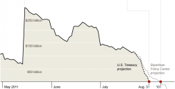
>But the point in that blog is that a chart can also show the correlation between the sun rising and the crowing of a rooster. That's one of the problems with putting up a chart and saying it explains everything.
Don't see any real point.
I understand that it is easy to believe in fairy tales. You can see very good correlation to real life.
So try to use KISS principle here.
As for this chart, it expains 100x more than all this who-is-reponsible-for-more-spending bullshit, made to distract average Joe.
As I already said, no good exit strategy can be made, any solution will lead to worse life.
But best solution, most probably, will lead to terrible life in short term with quite acceptable life in the longer term. -
@Vitaliy
>>>Diminishing returns correlate quite good with problems in real economy.>>>>>
But the point in that blog is that a chart can also show the correlation between the sun rising and the crowing of a rooster. That's one of the problems with putting up a chart and saying it explains everything.
<<<<The more problems you have, the more people become unqualified for any serious work (as no actual learning happens in real plants and firms) and the more you need to invest to get any progress. And as each investment dollar could go to virtual economy with good profits and to real economy with small or negative profits problems become even worse. <<<<<<br />
I agree, very sad. (Sad that I think it's true, not that I'm agreeing with you :) )
-
@brianluce
Nothing interesting in your link.
Diminishing returns correlate quite good with problems in real economy.
The more problems you have, the more people become unqualified for any serious work (as no actual learning happens in real plants and firms) and the more you need to invest to get any progress. And as each investment dollar could go to virtual economy with good profits and to real economy with small or negative profits problems become even worse. -
@Vitaliy
errr...yes of course. But there are many pet theories about why money flowing to debt is decreasing. Anyway, the second chart is interesting, here's a blog on it, some of the comments are interesting -- some suggest the chart shows a false cause and effect relationship between debt and GDP, in other words, just because the rooster crows in the morning, doesn't mean he caused the sun to rise. http://econospeak.blogspot.com/2009/09/dimiinishing-returns-for-each-dollar-of.html -
@brianluce
That's easy. US Economy is terminally ill.
In small scale - debt money partially stopped flowing into system, similar to clogged drip. -
@EOSHD
Kind of strange to read this from you.
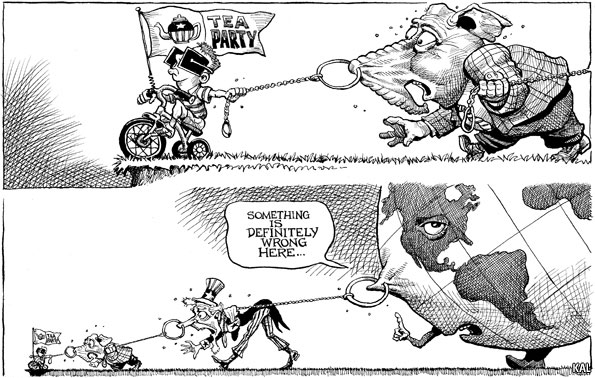
First chart is made by Obama goverment to force average people to make wrong conclusion.
Second chart is here to clearly say that this is not Obama or Bush problem.
I already wrote what this is the same as making scratch on painting near your seat responsible for the fact what you are heading directly to the ground :-) -
A right wing nut Bush screwed the US economy and now a right ring nut Boehner is trying to prevent it from being fixed.
This is because the right wing nuts prefer to take the USDs away from the treasury and the people and to put them in the hands of the private corporate giants.
The private sector claim to bring prosperity and employment but they are actually just black holes. Similar thing in nature. We use so much water at the moment in our industry, pipes, taps, kitchens that Africa is actually measurably drier.
As Daniel Day-Lewis would say:
"Milk shake... I suck it ALL up!"


Start New Topic


Howdy, Stranger!
It looks like you're new here. If you want to get involved, click one of these buttons!
Categories
- Topics List23,927
- Blog5,719
- General and News1,334
- Hacks and Patches1,148
- ↳ Top Settings33
- ↳ Beginners254
- ↳ Archives402
- ↳ Hacks News and Development56
- Cameras2,346
- ↳ Panasonic985
- ↳ Canon118
- ↳ Sony154
- ↳ Nikon95
- ↳ Pentax and Samsung70
- ↳ Olympus and Fujifilm98
- ↳ Compacts and Camcorders296
- ↳ Smartphones for video96
- ↳ Pro Video Cameras191
- ↳ BlackMagic and other raw cameras118
- Skill1,959
- ↳ Business and distribution66
- ↳ Preparation, scripts and legal38
- ↳ Art149
- ↳ Import, Convert, Exporting291
- ↳ Editors190
- ↳ Effects and stunts115
- ↳ Color grading197
- ↳ Sound and Music280
- ↳ Lighting96
- ↳ Software and storage tips266
- Gear5,408
- ↳ Filters, Adapters, Matte boxes344
- ↳ Lenses1,578
- ↳ Follow focus and gears93
- ↳ Sound496
- ↳ Lighting gear313
- ↳ Camera movement230
- ↳ Gimbals and copters302
- ↳ Rigs and related stuff271
- ↳ Power solutions83
- ↳ Monitors and viewfinders339
- ↳ Tripods and fluid heads139
- ↳ Storage286
- ↳ Computers and studio gear559
- ↳ VR and 3D248
- Showcase1,859
- Marketplace2,834
- Offtopic1,320
Tags in Topic
- economics 319


