
-
"Breaking Bad - wow, that's my favorite show of all time and it deserves its own thread :-) "
You might enjoy listening to this podcast (34 min, 65 MB download) http://www.theasc.com/podcasts/ac_podcasts/20_AC_Podcast_Breaking_Bad_Cinematography.mp3
"In part one, Michael Slovis, ASC talks with American Cinematographer’s Iain Stasukevich about how the supportive and collaborative team, from the network through to the crew, work together to capture the New Mexican landscape with a cinematic flair".
-
*Fav
-
Thanks for posting!!!
-
@Roberto Yes thank you!
-
Thanks for showing your appreciation. Now, Breaking Bad generates plenty of the usual fan stuff online, but I'd also like much more insight into how Slovis & crew get that look, (85% hand-held, sky gradated filters!). See behind-the-scenes photos at http://blogs.amctv.com/breaking-bad/2012/02/photos-behind-the-scenes-season-4.php
[Please let's tolerate their horsing-around photos and keep this thread to the techniques involved].
-
Some of the pics mentioned above...
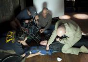
 ep9-3.jpg760 x 535 - 78K
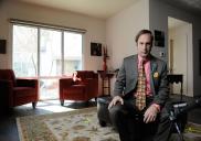
 ep3-1.jpg760 x 535 - 84K
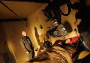
 ep4-2.jpg760 x 535 - 113K
 -
Myself hailing from Albuquerque, where it's filmed, this is great. I actually got the chance to talk to the editor for a bit but he wouldn't disclose any if the post process!
-
Yes, cannot praise Slovis enough. Love how he was saying how they like to keep everything low and wide. We also see a lot of high key balanced with total darkness and it's used brilliantly especially in day interior scenes - some great examples being the scenes in Gus's office trailer and the truck interior being lit up from bullet holes. It all leads up to this slow, restrained chaos that can and will blow up in any minute - but always as we least expect. A great team of writers, directors, actors, designers, and camera work. Heisenberg - bitch!
-
After watching Series II and replaying CU scenes, I've found that the hand held (or rather, shoulder-mounted shots comprising 85% of Slovis's work) waver only in the lateral sense, (like a tiny slider would), rather than pan or tilt.
The camera operator's move sideways and from the hip always seems to reveal something behind the subject, due to the parallax effect. The 3-D feel that brings, along with the wide lens and the closeness of the camera to the subject helps me as a viewer to feel involved in the scene and sustain that pervasive feeling that "something is going to happen."
A pity it's so hard to mount a DSLR on your shoulder. Some rigs have the film plane so far forward that even a pan at close range becomes a sweep through a radius of at least 12 inches. A viewfinder, mounted forward and at the side of the lens, would be do-able and I'm keen to hear of solutions.
-
@Roberto...
Been thinking about that setup myself... However that is what is 'great' about rails... simply reconfigure it! (Like PTools itself!)
-
lol its shot on film
-
@klem007 "lol its shot on film"
So
-
I never expected that a soap would have budget for film.. or the will to add to the production lenght
-
Gonna bump this thread because I've been addicted to this show on Netflix. The acting and writing is astonishing. I agree this is one of the best shows of all time. Every single scene oozes subtext. So complex especially in the ways it deals with morality and family. Vince Gilligan is badass.
I've found that the hand held (or rather, shoulder-mounted shots comprising 85% of Slovis's work) waver only in the lateral sense, (like a tiny slider would), rather than pan or tilt.
Anyone want to venture a guess as to why this is? I'm familiar with the aesthetic achieved with conventional handheld, wondering what they get with this variation that's different.
-
Maybe the lateral parallax views add closeness and subjectivity (POV) of the camera -
The young Polanski did camera POV parallax it in Knife in the Water when the character looks at the mast of the boat with one eye, then the other and the viewer then sees the mast pass from the left of the knife to the right,, and back again.
But in Breaking Bad, we're not told in who's time the movements happen. Have we become one of the family?
Honestly, I think there were accidental camera movement patterns set in place in Series 1 which just stayed as part of the aesthetic they'd created. Nobody, even Slovis, has dared do anything to break the spell.
But then, sometimes I think the cinematography is so good that they almost deliberately prove they can get away with stuff nobody else would dare try. I mean, a Pizza POV shot from within the microwave oven?
-
Thanks for the bump! Can't wait until Sunday.
-
Haha! "Hey, I'm a pizza!" Oh, who turned out the lights? Oh, Seems like I'm in a car trunk and Heisenberg is opening the lid and there are New Mexico mountains behind him!"
I love it all, of course. What I'm saying is, I read somewhere somebody describing this type of POV shot in a list of 10 don'ts for newbie film makers. (Off hand, I can't say I can recall seeing anybody anywhere either over-using or mis-using such shots, myself).
Anyway, we certainly see heaps of them in Bad. I guess that puts Michael Slovis in the camp of the rank amateurs whose only hope is this year's Summer Camp Film School.
(Oops, now I'm a fly!)
-
Life isn't colored evenly. Take a living room in the afternoon, for example. Streaks of sunlight may squeeze through the opened blinds of a window, illuminating specs of dust and part of someone's face, leaving the other part in shadow. As day turns to evening, those streaks will fade, and then it might be a lamp or the glow of a television that splashes the room with color.
...the camera moved in closer on the two men's faces but we never saw either of them wholly; the sunlight coming in through the windows not only colored the room unevenly, but it also illuminated only half of each man's face, leaving the other halves in complete shadow. The darkness of the scene matched the narrative, and the shadow upon those faces doubled as a symbolic touch, both of these men leading double lives. ...
Slovis came to Albuquerque and added his own stamp on the show's look. "I think I made it darker -- I added a little more shadow to it to help the story along, and I wanted more things to play in silhouette when appropriate. At the same time, I think the show is a show of contrasts, and so there are little hot spots in there when something could be completely dark or completely backlit or completely silhouette; there might be a little highlight, you know, that draws your eye to fill the frame. That's another thing I wanted to do to give it that painterly feel."
From Los Angeles Times May 16, 2010 ...Full story and pictures - Breaking Bad - Michael Slovis, a visual storyteller
-
It's ground-breaking that LA Times' Entertainment section is prepared to cover a TV series from a cinematographic point of view. Perhaps this shows how Bad has earned itself itself a reputation for its visuals - and possibly these days so many of of its readers shoot video themselves.
Some salient points from this article:
Shot on 35-millimeter film rather than digitally, the look of "Breaking Bad" is distinctly cinematic. ... using a specific stock of Kodak film that's "almost grain-less" in order to capture the beauty of the desert. He also puts a tobacco filter -- a very thin glass -- over the camera lens to give those exterior shots a particular hue. [Slovis says],"The desert in New Mexico is so brown that [the filter] makes the browns really pop and gives it a really pleasing skin tone to me."
-
Can't fucking wait!
-
Doesn't Slovis know film is dead? And what's with lens filters? You do all that in post with Adobe Magic FXbs plugin package. Easily available on PirateBay. Obviously the dude is a rank amateur.
Love this Slovis quote: Slovis said. "I would not feel that I did this show justice or I was successful with this show if people noticed my photography [too much]. I don't want them to. I want a marriage. I want the lighting and the look and the performance -- I want them all to be as one. What I would really love is for someone to look at that and think that everything is exactly in the right place and in the right proportion in terms of telling a good story.
Howdy, Stranger!
It looks like you're new here. If you want to get involved, click one of these buttons!
Categories
- Topics List23,993
- Blog5,725
- General and News1,354
- Hacks and Patches1,153
- ↳ Top Settings33
- ↳ Beginners256
- ↳ Archives402
- ↳ Hacks News and Development56
- Cameras2,368
- ↳ Panasonic995
- ↳ Canon118
- ↳ Sony156
- ↳ Nikon96
- ↳ Pentax and Samsung70
- ↳ Olympus and Fujifilm102
- ↳ Compacts and Camcorders300
- ↳ Smartphones for video97
- ↳ Pro Video Cameras191
- ↳ BlackMagic and other raw cameras116
- Skill1,960
- ↳ Business and distribution66
- ↳ Preparation, scripts and legal38
- ↳ Art149
- ↳ Import, Convert, Exporting291
- ↳ Editors191
- ↳ Effects and stunts115
- ↳ Color grading197
- ↳ Sound and Music280
- ↳ Lighting96
- ↳ Software and storage tips266
- Gear5,420
- ↳ Filters, Adapters, Matte boxes344
- ↳ Lenses1,582
- ↳ Follow focus and gears93
- ↳ Sound499
- ↳ Lighting gear314
- ↳ Camera movement230
- ↳ Gimbals and copters302
- ↳ Rigs and related stuff273
- ↳ Power solutions83
- ↳ Monitors and viewfinders340
- ↳ Tripods and fluid heads139
- ↳ Storage286
- ↳ Computers and studio gear560
- ↳ VR and 3D248
- Showcase1,859
- Marketplace2,834
- Offtopic1,320


