-
Idea to make laptop with thinner front is old and had been implemented by marketing departments due to two reasons.
First, it is cheap way to make laptop look thinner (as buyer look at the row of notebooks at the store).
Second, it is also cheap way to make laptop weaker, slightly lighter and, important also, save on materials, battery and extra ports.
In reality laptop must be simple brick with slightly rounded corners and without any slanted things in design or construction.
Want to make it thin - do it, but for real reason, not for nice looks and more profits.
Modern press, especially youtube "reviewers" (aka promoters of corporate motto) played significant role to make it possible by silencing and blocking real feedback.
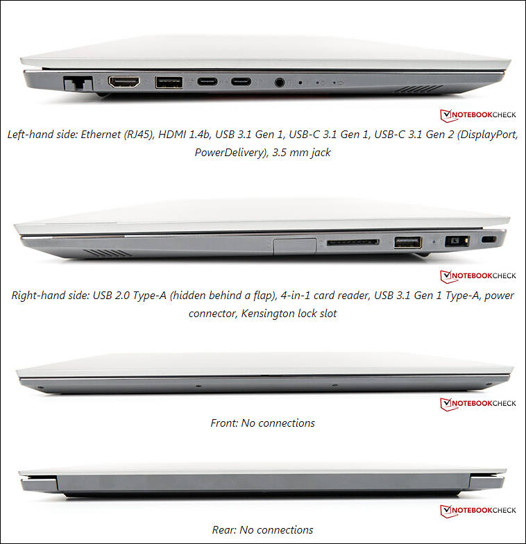
Sample of more bricky design (with lot of space unused)
-
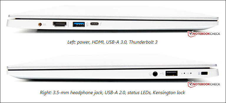
Another abortion of designers mind - newest Dell XPS
 sa17486.jpg794 x 424 - 38K
 -
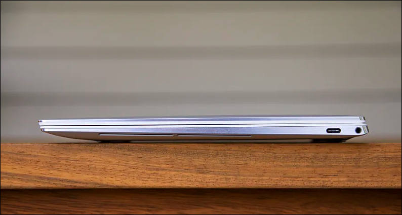
Even small and slim things are better as a brick:
-
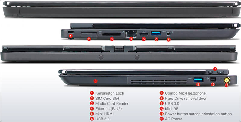
ThinkPad X1 Extreme 3

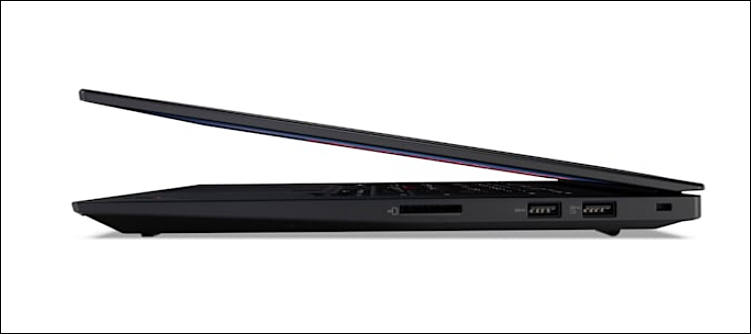
This generation they again made horrible trackpoint buttons. I think it is 3rd or 4th attempt, they never learn.
Can also someone explain to me why we always need thin notebooks (question from Carbon and 4x Yoga notebooks owner, so I know that I talk about)?
 sa17502.jpg741 x 544 - 44K
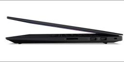 sa17503.jpg751 x 334 - 20K


Howdy, Stranger!
It looks like you're new here. If you want to get involved, click one of these buttons!
Categories
- Topics List23,993
- Blog5,725
- General and News1,354
- Hacks and Patches1,153
- ↳ Top Settings33
- ↳ Beginners256
- ↳ Archives402
- ↳ Hacks News and Development56
- Cameras2,368
- ↳ Panasonic995
- ↳ Canon118
- ↳ Sony156
- ↳ Nikon96
- ↳ Pentax and Samsung70
- ↳ Olympus and Fujifilm102
- ↳ Compacts and Camcorders300
- ↳ Smartphones for video97
- ↳ Pro Video Cameras191
- ↳ BlackMagic and other raw cameras116
- Skill1,960
- ↳ Business and distribution66
- ↳ Preparation, scripts and legal38
- ↳ Art149
- ↳ Import, Convert, Exporting291
- ↳ Editors191
- ↳ Effects and stunts115
- ↳ Color grading197
- ↳ Sound and Music280
- ↳ Lighting96
- ↳ Software and storage tips266
- Gear5,420
- ↳ Filters, Adapters, Matte boxes344
- ↳ Lenses1,582
- ↳ Follow focus and gears93
- ↳ Sound499
- ↳ Lighting gear314
- ↳ Camera movement230
- ↳ Gimbals and copters302
- ↳ Rigs and related stuff273
- ↳ Power solutions83
- ↳ Monitors and viewfinders340
- ↳ Tripods and fluid heads139
- ↳ Storage286
- ↳ Computers and studio gear560
- ↳ VR and 3D248
- Showcase1,859
- Marketplace2,834
- Offtopic1,320


