It allows to keep PV going, with more focus towards AI, but keeping be one of the few truly independent places.
-
Hi,
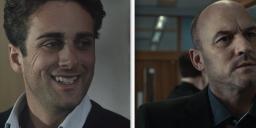
Here is a frame grab from my short film, shot on the GH2. It's a drama but at the moment the footage looks too "nice" so I want to give it a different look in resolve.

Can anyone give me some advice on how to get a drama look like similar to the images below from a BBC tv drama. I appreciate that the BBC thing would have been shot on something like an Alexa and lit by a pro but it also looks as if they have given it a look in post.
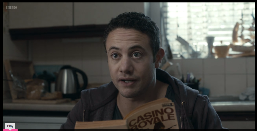
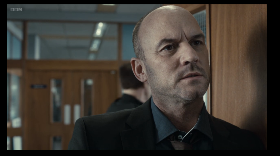
I've tried desaturating and cooling it down but it ends up looking wrong, maybe it's a limitation of the 8 bit gh2 footage.
Any help and advice would be much appreciated
Thanks
Tony

 TOM-still.jpg800 x 450 - 41K
 Screen Shot 2012-09-09 at 15.31.28.png847 x 433 - 342K
 Screen Shot 2012-09-09 at 15.32.24.png896 x 501 - 378K
 -
Desaturate. Bias the mids a bit to the yellow side of things. Bring the blacks down a bit and try to stay away from raising the highlights. Use curves and be sure to do each adjustment in a new node. You've got a good amount of DR here to work with so it should be no trouble.
-
Hi ! I don't pretend to be a colorist, but I did a quick unpretentious test, tell me if it's what your looking for because it's quick and easy to achieve.
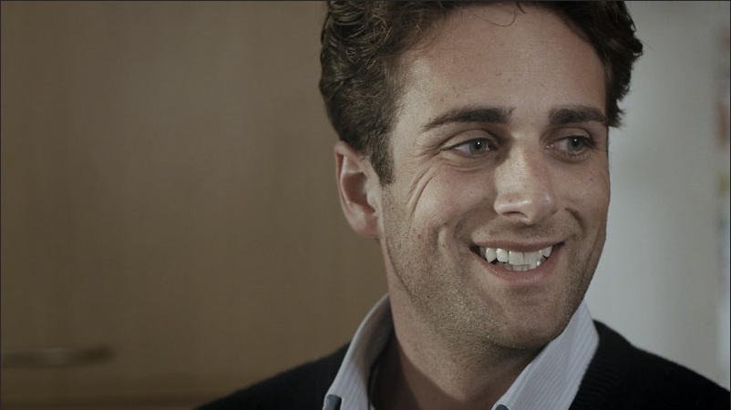


 bbc2.jpg802 x 450 - 63K
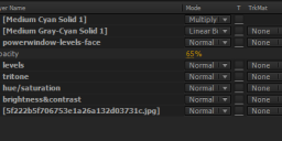
 layers-bbc.png722 x 210 - 27K
 -
@rockfall what editor do you use?
-
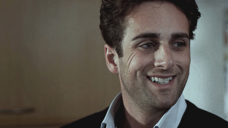
Shadow's towards Red
Mid's towards cyan
Highlight's towards cyan/yellow
Increase contrast, then raise blacks
lower vibrance and saturation

 grade.jpg800 x 450 - 153K
 grade.jpg800 x 450 - 153K
 -
Many thanks for the suggestions, I'll have a play around in Resolve and see what I can do. Look like i'll need to be isolating skin tones.
@RRRR I use Premiere.
-
Pull the mids toward yellow, pull the shadows toward blue. You could get a subtle effect like what @krotal posted without isolating the skin tones, but to really make it pop, something like Magic Bullet Mojo would help. I don't know what Resolve offers in the way of skin tone isolation.
-
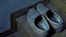
Here is my quick test in Photoshop also. I changed the mode to 16-bit and started with levels flattening Red and Green channels. Then continued with color balance and HSL. Your image survived the grading, but just barely and started to fall apart in the end. Neutrally balanced image has quite lean colors encoded by AVCHD. For comparison I also attached a sample that was lens filtered, custom white balanced and exposed for highest gradability on location.
If you opened the ungraded version in Photoshop (shoes.jpg), changed the mode to 16-bit and then adjusted Hue slider, you should be able to turn the hues all the way around without the image falling apart. Now many kinds of clean grades and color combinations would be possible.
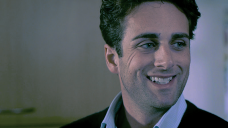
 testGrade.png800 x 450 - 417K
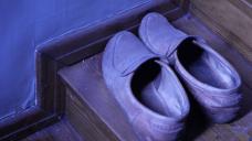
 shoes.jpg1920 x 1080 - 242K
 shoesGraded.jpg1920 x 1080 - 723K
 -
@rockfall: do you have AE then, too? You could do two tritones (one brown, one blue towards cyan) and mix them up..
-
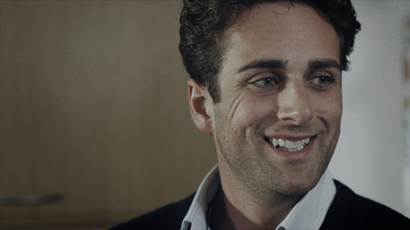
Hopefully this will provide some hints on trying to get that look you wanted.


 cctest.jpg800 x 450 - 98K
 afxsettings.gif431 x 1500 - 39K
 -
@aki_hartikainen Wow, that's a really convincing mercury vapor look. With a technique like that I could eliminate the gas discharge lamps and save a bunch on my next zombie flick.
-
I hardly tried to create final result, but used the opportunity to push some material a bit and especially tried the trickier bluish hues that rely on the weakest of the channels in these cameras. So all of the samples I provided are heavily exaggerated.
If you took the ungraded GH1 sample that I provided and tried to grade it like I described, you would notice that it will grade cleaner and with much more color saturation and you could turn the colors to your liking. In that case the custom white balance was leaning toward blue-yellow, but it would have been able to adjust it to lean on red-cyan, that would have given a different but equally clean saturated palette for different color. The palette in these cameras is limited, so one could optimize it on location for stronger saturation grades.
I think I could replicate the BBC look with that camera setup rather good. GH2 would probably do it without any trouble. The filter and custom white balance combinations resemble the missing custom picture profiles. 8-bit 4:2:0 palette could display a good image, but it will not grade perfectly. When filming it is possible to create a bias for the desired final colors and thus achieve cleaner and more saturated grade. The bias does not always have to be exaggerated but could be subtle aswell.
-
@LPowell here you could have a look what they use for custom contrast for B&W photography and cinematography: http://www.ilfordphoto.com/aboutus/page.asp?n=117
For B&W photography filters from yellow to magenta are used to adjust contrast. Similarly for video the contrast could be adjusted. Side-effect is boost in color saturation. The filters used for this are not just some color filters like Tobacco, for example. But exact filters for primary and secondary colors. This will make the "filter picture profiles" accurate and consistent.
-
I have noticed you posting some stuff about shooting with filters to capture a weird looking image that at least has more information in it for grading. It is something I have given some time to considering because I have also noticed that the R,G,B,G histograms from GH2 Raws are quite unbalanced when viewed in Rawdigger.
I think LPowell also makes a point that your demo image does not look that nice even after grading so I can see that your ideas may have technical merit but for now lack a good working example.
Perhaps using filters is more relevant to RAW capture as the JPEG and AVCHD engines in the GH2 probably compensate for whatever specialisation exists in the GH2 for having a wide green, sensitive red, and a narrow blue response. I do look at the Raws and notice the pedestals and gain of the channels are very different so on that count I think you have some interesting ideas.
Bwhitz and Krotal get the job done but yall should post PNG instead of JPEG if you are going to put out grading challenges.
-
The problem often is to meet certain quality criteria after heavy grading. So I tried to provide examples of rather heavily graded material, especially with the often coarse blue channel. Others already provided good milder grades, so I did not try to duplicate the work. As LPowell mentioned, the zombie look could be done convincingly without the image showing banding and posterization and that was in available light, which I always try to use as much as possible. It will eventually do fine looking subtle grades aswell and with consistent results that could be easily duplicated and changed for another look with ease. I am hoping to provide a whole set of filter picture profiles for many kinds of purposes.
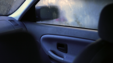
Technically the best source image for grading appears to be such that a) shadows are lifted and contrast flattened (magenta filter) and b) channels lean on either red-cyan or blue-yellow (cyan or yellow filter of varying densities used for white balancing). Now the channel values do not quite overlap but are suitably dithered for clean color gradients without banding and color saturation is boosted optically in the lens. Attached is a sample that managed to capture the bluish interior hues in low available light rather well using this method.
If the filter and custom white balancing were not used, the bluish hues would have appeared coarse and posterized with that color saturation. It is now possible to de-saturate the image without penalty.
 interiorGraded.png1920 x 1080 - 3M
 -
@RRRR yeah I've got AE but I'm only just learning the basics so I'm not very good at it yet.
@retrospective Thanks for that, very helpful, I like the skin tones. Can that sort of thing be done in premiere aswell or is it just an AE thing?
I'm going to take a look at magic bullet mojo aswell and see what the skin tone isolation is like.
-
@rockfall: it might be a good move then for you to check out @shian s colorghear toolkit + tutorials. It´s cheap as chips compared to magic bullet software. I think it will help massively for you to get a good workflow in AE, which is much more powerful than premiere when it comes to grading / coloring.. If you don´t have a lot of time it might be a different story, of course. (then think about it for a different project).
Personally I´m not too happy about Magic Bullet. I haven´t used mojo, but Looks I find has a way of fucking with things that are not meant to be fucked with. :)
I got a license for Neat Video to use with AE; it´s really helpful when pushing for "extreme" grades which can cause excessive noise sometimes (I then de-noise and re-grain the footage before exporting).
-
@rockfall no problem, I am sure you can achieve the same thing in Premiere, I think it has most of those plugins available from AE!
-
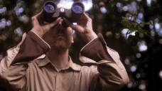
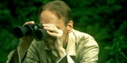
Here is a test grade from a test movie, trying to get people look manageable without makeup or lighting using levels, curves and HSL. I used lens filtration, both color compensation and diffusion. It is tricky to get somewhat even skintones when adjusting curves a lot. Results also vary between monitors.
I think it is a good starting point to decide how the people should look like and then try to maintain that between scenes.
 binoculars.png1440 x 810 - 2M
 -
There's one fundamental issue with your core image: it all falls into mostly one spectrum of light. Looks like you've got one daylight source, and one or two sources in the 5000K range.
The examples you showed have mixed color temps, or has skin isolated so that it remains the color of skin.
You'll have to actually key your image to get that look, and maybe mask. The quickest way to get where you want is to shoot for the look in camera: use a Kino for backlight and a tungsten source for fill, key, etc.
-
It is now very similar compared to the sample, but a little info on how it was achieved could be useful. Here is another of the binocular theme with a little less diffusion. Again just testing a bit in Photoshop using levels, curves and HSL still trying to avoid "post heavy" look. I could try to adjust the skin tones a bit like in the samples above.
 binoculars2.png1440 x 612 - 1M
 -
I agree with Kholi, it's moot, but you'll make things way easier next time if you get the look you want on the set. With Lights! This kind of thing always feels like backfilling. It's so time consuming, and the 4:2:0 sampling won't help your cause.
-
I agree other than lighting could cost a lot in many ways on the sets, but adjusting hues later only costs time. It is a good idea to try to use available light as much as possible.
Then adding just a little bit of creative lighting should make a difference.
-
@kholi @brianluce Thanks guys, this was more a case of me changing my mind. I shot it that way (with my limited lighting skills ) and was happy with it then saw something on TV I liked the look off. I expect I'll change my mind again next week!
I'm only an amateur filmmaker doing this as a hobby so I'm still learning.
-
I used only levels this time. I changed the display for Hue, Saturation and Brightness, then compared those values from the actors faces. I did not try to make them as identical as possible.
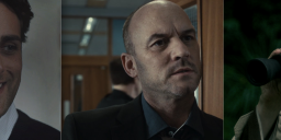
 threeGrades.png1600 x 445 - 810K
Howdy, Stranger!
It looks like you're new here. If you want to get involved, click one of these buttons!
Categories
- Topics List23,993
- Blog5,725
- General and News1,354
- Hacks and Patches1,153
- ↳ Top Settings33
- ↳ Beginners256
- ↳ Archives402
- ↳ Hacks News and Development56
- Cameras2,368
- ↳ Panasonic995
- ↳ Canon118
- ↳ Sony156
- ↳ Nikon96
- ↳ Pentax and Samsung70
- ↳ Olympus and Fujifilm102
- ↳ Compacts and Camcorders300
- ↳ Smartphones for video97
- ↳ Pro Video Cameras191
- ↳ BlackMagic and other raw cameras116
- Skill1,960
- ↳ Business and distribution66
- ↳ Preparation, scripts and legal38
- ↳ Art149
- ↳ Import, Convert, Exporting291
- ↳ Editors191
- ↳ Effects and stunts115
- ↳ Color grading197
- ↳ Sound and Music280
- ↳ Lighting96
- ↳ Software and storage tips266
- Gear5,420
- ↳ Filters, Adapters, Matte boxes344
- ↳ Lenses1,582
- ↳ Follow focus and gears93
- ↳ Sound499
- ↳ Lighting gear314
- ↳ Camera movement230
- ↳ Gimbals and copters302
- ↳ Rigs and related stuff273
- ↳ Power solutions83
- ↳ Monitors and viewfinders340
- ↳ Tripods and fluid heads139
- ↳ Storage286
- ↳ Computers and studio gear560
- ↳ VR and 3D248
- Showcase1,859
- Marketplace2,834
- Offtopic1,320


